
How to Create a Personal Productivity Dashboard That Works
Learn how to create a personal productivity dashboard with key metrics, project tracking, and review tips to boost your focus and progress.
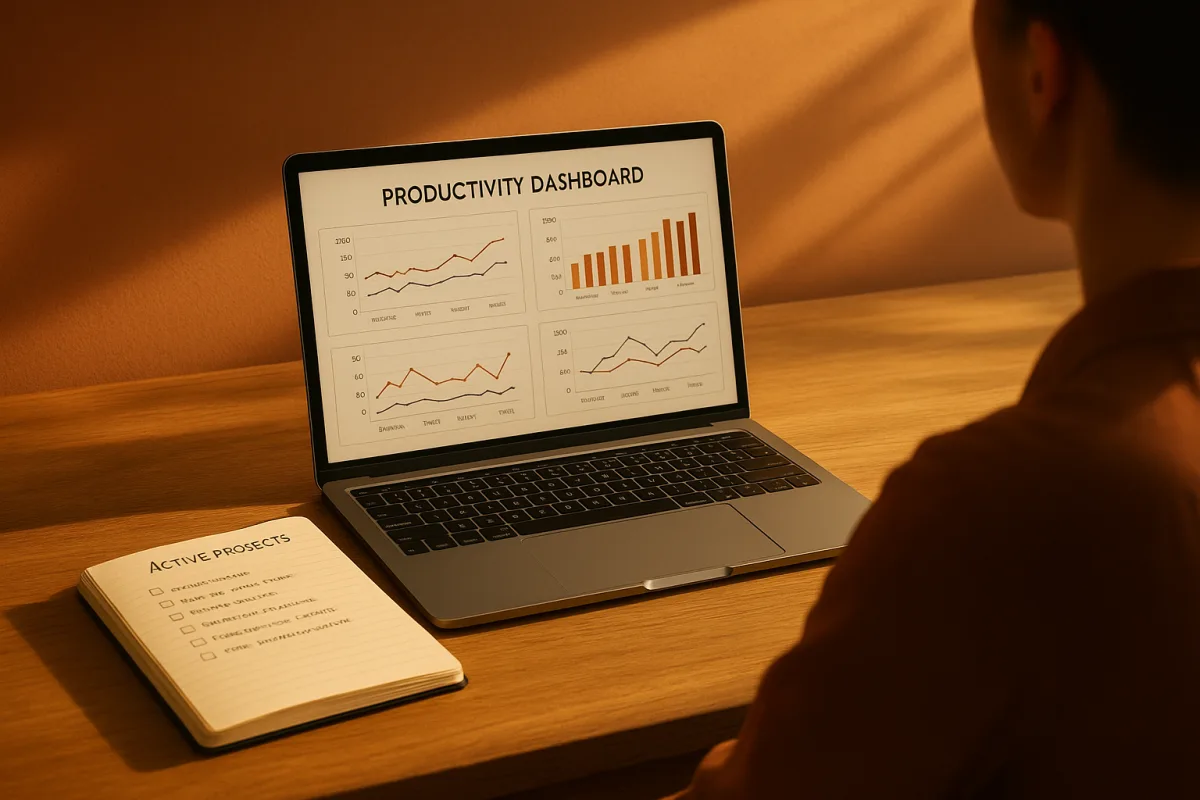
Start with the question, not the software
The first problem is not choosing a tool. It is deciding what the dashboard should tell you when you open it on a busy Tuesday. Dashboards become cluttered when they have no primary question to answer. [14]
A workable question is narrow and practical: “Am I completing the work I planned?”, “Is my main project moving?”, or “Where did my available work time go?” Pick one question for the top of the page.
This matters because a personal dashboard can easily become a collection of attractive counters. LifeTweakHQ specifically recommends limiting the view to four high-signal metrics, warning that too many variables create cognitive overload and eventual abandonment. [19]
Do not begin by tracking every area of life. A screen covering tasks, reading, exercise, finance, mood, email, meetings and ten different project categories asks for constant maintenance before it provides any useful answer.
The two parts that tend to survive are a short view of commitments and a short view of progress. Everything else has to justify the time needed to enter, interpret and review it.
Choose one primary metric you can actually act on
Put one primary metric at the top. The metric should have a baseline, a target and a defined time period, such as “three focused work blocks this week, target: five,” rather than “be more focused.” [3][9]
For a project-based role, the primary metric might be task completion within deadlines. For writing or research, it could be completed deliverables or focused work blocks. For a student, it may be planned study sessions completed.
The important distinction is between activity and outcome. Counting messages sent may be relevant in a sales role, but it is a weak personal productivity measure if your actual problem is unfinished project work.
A useful second measure is the planned-to-done ratio: how many of the tasks you planned were completed. [9] It exposes a recurring issue with elaborate task systems, namely that the daily list often represents optimism rather than capacity.
Do not treat a low ratio as evidence of weak character. It may mean tasks were too large, interruptions took over, priorities changed or the estimate was wrong. The dashboard should make that pattern visible, not assign blame.
Give numbers enough context to mean something
A bare total encourages snap judgments. Put a seven-day or 30-day trend line beside your primary metric, then add a current-versus-baseline comparison using a simple bar or delta indicator. These are established dashboard components because they answer whether the number is changing. [3]
For example, if you completed four planned tasks today, that number alone says little. Four may be a good day if your usual number is two, or a warning sign if you had planned ten.
Use segment breakdowns only when they lead to a decision. Splitting work into project types, clients, study subjects or administrative work can show where time and effort are going. [9] It is not useful merely because the software can draw a pie chart.
Keep visual conventions stable. The dashboard design guidance from UXPin and Datawireframe warns that inconsistent colours, fonts and formats make interpretation harder. [13][14] Use one colour for completed work, one for blocked work and one for due soon.
Avoid gauges, decorative icons and multiple chart styles unless they communicate something your table cannot. Overcomplicated layouts make navigation slower, particularly when you only have a few minutes to plan or review. [15][16]
Add projects before you add habits
Once the top-level measures are in place, create an active-projects section. Limit it to five to seven ongoing projects and show the same fields for each: status, priority, next action, deadline and a simple progress indicator. [4]
“Next action” is the field doing the real work here. “Website redesign” is a project label, not something you can do between meetings. “Draft the homepage outline” is a next action that can enter today’s plan.
A project that lacks a next action should be marked waiting, blocked or someday, rather than remaining falsely active. This is where dashboards commonly break. They display a long list of ambitions but do not help choose what happens next.
If you use progress percentages, define what they mean. A percentage based on completed milestones is more interpretable than a number based on vague feeling. Where the work cannot be meaningfully quantified, use a short status label instead.
Keep completed projects out of the main view. Archive them in the underlying database or task manager. The dashboard is a current decision surface, not a memorial to every finished task.
Track focus without pretending every hour should be productive
Focus hours can be worth tracking if protected work time is central to your goals. Smartkeys recommends a target of 60 to 120 minutes of protected deep-work blocks per day, though that is a planning benchmark rather than a medical or universal standard. [9]
Record the block, not a heroic claim of concentration. A simple daily count of scheduled and completed focus blocks gives you something to review: whether you protected the time, and whether your calendar made that realistic.
You can also track productive-time ratio, defined as active work time against scheduled work time. E-Monitor gives a typical knowledge-work range of 62 to 70 percent, while also warning against treating 100 percent utilisation as the goal. [10]
That figure is a broad benchmark, not a prescription for an individual. Meetings, caregiving, administrative work and the nature of a job all change what a reasonable ratio looks like. Use it to spot patterns, not to fill every available minute.
If sleep, mood, attention or persistent fatigue are affecting your ability to work, do not turn the dashboard into a self-treatment plan. Those are questions for a doctor or other qualified clinician, not productivity metrics to optimise.
Add habits only when the tracking serves the goal
A habits and systems section can connect daily behaviours to the work you are trying to do. Common entries include exercise, reading, meditation, deep-work blocks, creative output and administrative tasks. [4][5]
Make each habit observable. “Read” is ambiguous. “Read for 20 minutes after lunch” or “complete one assigned chapter” can be marked done without negotiating with yourself at the end of the day.
Do not add a habit simply because it seems like the sort of thing productive people track. If you cannot explain how it supports your current goal or routine, leave it off the dashboard.
Integrated tracking is not automatically the best option. ClickUp can handle recurring tasks and reminders, but dedicated habit tools such as Streaks, Habitica and Way of Life may be more streamlined or motivating for habit tracking. The brief does not provide direct comparative evidence, so this remains a practical design choice rather than a proven result. [6][8]
Use the dashboard to display a small habit summary, while letting a specialised app handle reminders or streaks if that reduces friction. Duplicating every check mark across two systems is the sort of upkeep that makes people stop reviewing both.
Choose the tool after you know the shape of the system
Notion suits someone who wants flexible databases, linked pages and a highly customised central workspace. It can hold projects, goals, habits and reflections in one place, but that flexibility also means you must design and maintain the structure. [7]
ClickUp suits people who want tasks, recurring actions, reminders and dashboard widgets in a single work-management platform. Its breadth can be useful for complex projects, though it may be excessive for a personal dashboard with only a few measures. [6][7]
Todoist suits a task-first system, particularly if quick capture and natural-language task entry matter more than building charts and databases. It works best when the dashboard is mostly a clean task and project view. [6][8]
Wrike suits people whose personal planning is closely tied to formal work projects and real-time reporting. Its dashboards and AI-powered features are designed for work management, so it is unlikely to be the lightest option for a private weekly plan. [6][7]
Sunsama suits calendar-led planning. It combines tasks, email and calendar events, which is useful if the real issue is fitting commitments into available time rather than collecting more metrics. [8]
The research brief does not provide prices for these tools, so do not choose on assumed cost. Check current plans and free-tier limits yourself, especially before building a system that depends on paid dashboard features or integrations.
Put reflection behind the numbers, not beside twenty more charts
A reflection layer can help explain what the metrics miss. Notion dashboard guidance commonly includes journaling, emotional reflection and behavioural analysis as part of a personal system. [4]
Keep it brief. At the weekly review, write answers to three prompts: What moved forward? What repeatedly got delayed? What should change next week? That turns the dashboard from a scorecard into a planning tool.
There is no direct evidence in the research brief that journaling improves productivity outcomes. Its value here is interpretive: it can reveal that a poor completion week followed a changed schedule, unclear project scope or too many commitments.
Do not require a daily essay. If a reflection field becomes another overdue task, remove it. The point is to provide context for decisions, not to produce a detailed record of every working day.
Build a review that matches the system you created
A dashboard with no review rhythm quickly becomes a screenshot of an old plan. Life System OS suggests a five-minute weekly review for keeping a simple dashboard current. [3]
Aftertone recommends 20 to 30 minutes for a practiced weekly review, particularly where there is a backlog to process. [11] These are not conflicting rules. They describe different levels of system complexity.
For a simple dashboard, review the primary metric, update active projects, choose next actions and clear completed items. For a larger system, add backlog triage, deadline checks and a look at repeated delays.
Use the review to remove measures that have stopped influencing decisions. If you have not changed a plan because of a chart in several weeks, that chart is decoration and can probably go.
There is no solid evidence on how much time people typically spend updating personal dashboards beyond these recommendations. Start small, notice the maintenance burden, and make the system earn every additional field.
Frequently Asked Questions
How do I create a personal productivity dashboard?
Start by choosing one primary question your dashboard should answer, such as “Am I making progress on my most important project?” Limit the dashboard to four high-signal metrics to keep it readable and actionable. Include a short view of your active commitments and progress rather than trying to track everything at once.
What metrics should I track on a productivity dashboard?
Track a primary metric with a clear baseline, target, and time period, like “three focused work blocks this week, target: five.” A useful second metric is the planned-to-done ratio, showing how many planned tasks were actually completed. Avoid tracking activity alone; focus on outcome-based measures relevant to your goals.
How many projects should a productivity dashboard show?
Keep no more than five to seven active projects visible on your dashboard. Each project should have a next action and a deadline to maintain clarity and focus, rather than turning the dashboard into a complete archive of all possible tasks.
How do I interpret numbers on a productivity dashboard?
Numbers should be given context with trend lines over seven or 30 days and comparisons against baselines or targets. For example, completing four planned tasks today means little without knowing if that is above or below your usual performance or plan. Avoid snap judgments and look for patterns over time.
What is the best way to review a personal productivity dashboard?
Set aside a weekly review time that fits your system complexity—this can range from five minutes for simple setups to 20-30 minutes if you have multiple projects or a backlog. Use this time to update your metrics, reflect on progress, and adjust plans accordingly.
How we researched this
This article was assembled from 19 cited references.
Nothing here is based on hands-on testing. Where a figure or finding appears, it belongs to the source cited beside it, and the writing says so rather than implying otherwise. Every source is listed below so you can check it.
Sources
- A Culturally-Aware Tool for Crowdworkers: Leveraging Chronemics to Support Diverse Work Styles
- Designing Eval Dashboards That Drive Action | eval.qa Learn
- How to Create a Personal Productivity Dashboard That Works — Life System OS | LifeSystemOS — Life Operating System
- What to Include in a Notion Productivity Dashboard (6 Essential Sections)
- Productivity Dashboard Guide for 2026 | Build a Clearer Focus System
- Top 10 Best Personal Management Software | 2026 Expert Picks
- Top Rated Dashboard Software with Customizable templates 2026 | GetApp
- The best productivity apps for Mac | Zapier
- Personal Productivity Metrics 2026: What to Actually Track
- Employee Productivity Benchmarks 2026 | E-Monitor
- How to Do a Weekly Review (The System That Actually Sticks) — Aftertone
- How to Create a Productivity Dashboard for Work and Study | CENTPAGE
- Dashboard Design Principles: The Definitive Guide (2026) | UXPin
- 7 Common Dashboard Design Mistakes (And How to Avoid Them) | datawirefra.me
- Common Mistakes in analytics dashboards that improve productivity - UMA Technology
- Excel Project Dashboards: 5 Common Mistakes to Avoid
- Data on Productivity Apps 2026 — Usage Stats & Trends | fouzanadil.com
- Dashboard Design Trends 2026: Which Ones Actually Matter
- How to Build a Productivity Tracking Dashboard | LifeTweakHQ
Related Articles
How to Measure Productivity Effectively
Learn how to measure productivity effectively using progress, quality, and time tracking for meaningful insights into your work.
Using Feedback for Productivity Improvement
Learn how to use feedback effectively to improve your productivity with actionable steps and optimal feedback frequency.
Best Productivity Journals
Compare the best productivity journals, Full Focus Planner and BestSelf 13-Week Self Journal, to find the right fit for your goal tracking needs.

Mastering the Attention Economy: Break Free from Digital Distractions
Better Than Yesterday explores the attention economy, revealing how technology manipulates our focus for profit. Learn to break free from digital distractions, reclaim control over your attention, and boost creativity by embracing moments of boredom. Master your digital habits for a clearer, more energized mind in today's fast-paced world.